Medhabiyan Logo Design Case Study
Inspiring Knowledge with Simplicity
Client: Medhabiyan | Industry: Education (Courses) | Location: Bangladesh | Tools Used: Adobe Photoshop, Google Fonts, Coolors.co, LogoAI Mockup
1️⃣ Project Overview
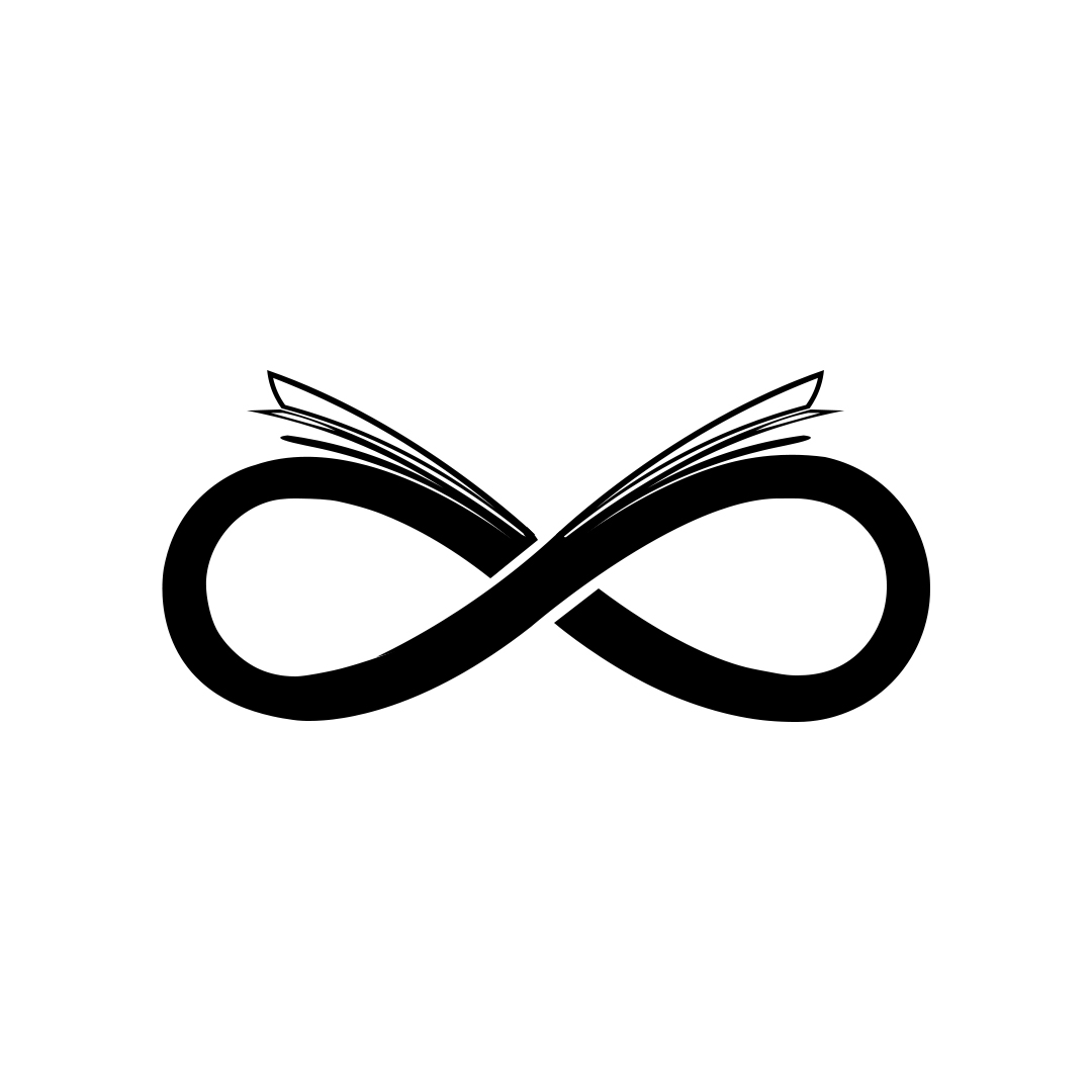
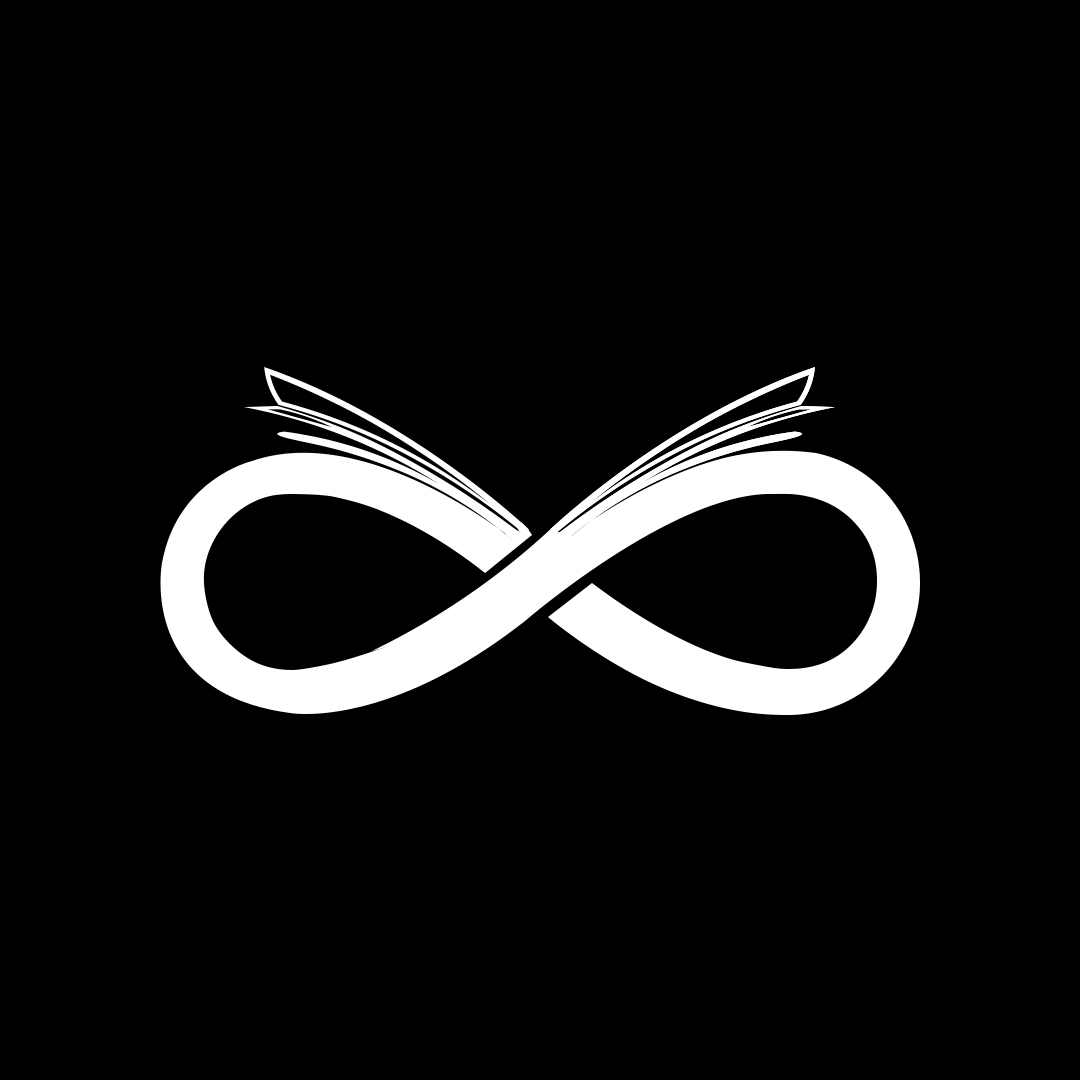
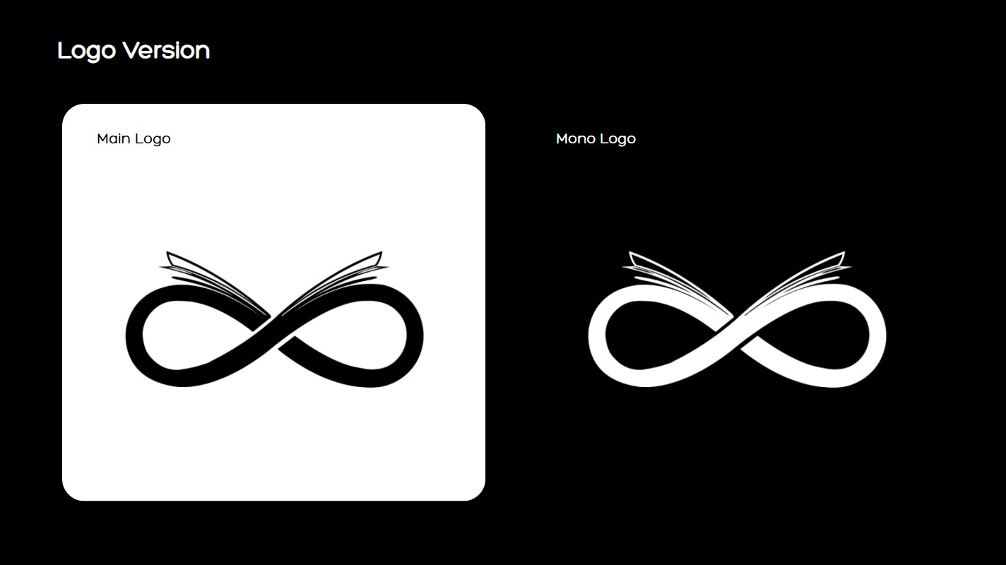
Design a simple, meaningful, and memorable logo for an educational brand named Medhabiyan, symbolizing infinity, knowledge, and clarity using a combination of custom book graphics and infinite shape.
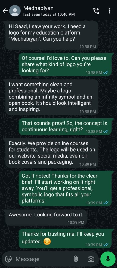
1️⃣ Collecting Client Requirements
Brand Name: Medhabiyan
Slogan: Not provided
Business Type: Education Company (Online Courses)
Target Audience: Students
Logo Concept:
- A clean and professional look
- Combination of an infinity symbol and an open book
- Must feel inspiring and intelligent
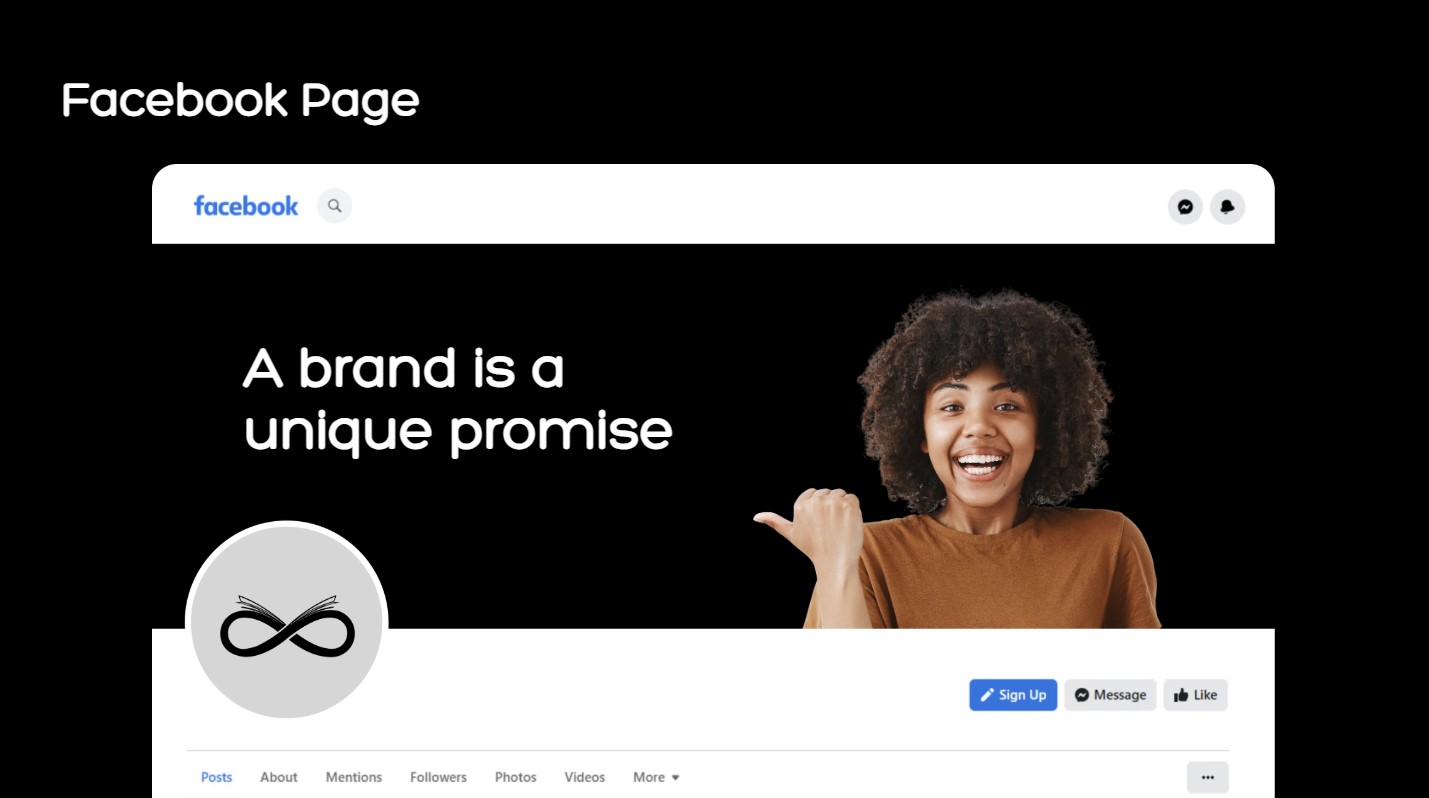
Usage Platforms: Website, Facebook, Instagram, YouTube, TikTok, Book Covers, Car Branding, Product Packaging
Communication Platform: WhatsApp
Explanation:
The client clearly expressed the desire for a logo that looks clean, professional, and instantly memorable. During our WhatsApp communication, they suggested a symbolic blend of an infinity shape with an open book, aiming to visually represent continuous learning. The brand’s purpose—delivering quality education to every student—was the guiding vision. Therefore, the logo had to be versatile, visually intelligent, and effective across both print and digital mediums.
2️⃣ Research & Inspiration
- Explored icons and minimal designs via Google & Pinterest
- No direct logo inspiration; the idea was sparked by observing the infinity shape
- Shared the concept with ChatGPT for refining and enhancing the design direction
Goal:
To design a simple yet thoughtful logo combining the infinity symbol and an open book, emphasizing limitless learning.
Explanation: While researching educational icons, I stumbled upon the infinity symbol, which immediately sparked a powerful idea: blending it with an open book to represent “endless knowledge.” I discussed this concept with ChatGPT to clarify its execution, visual logic, and symbolism. The aim was to keep the identity minimal yet meaningful, something that students and learners can instantly connect with.
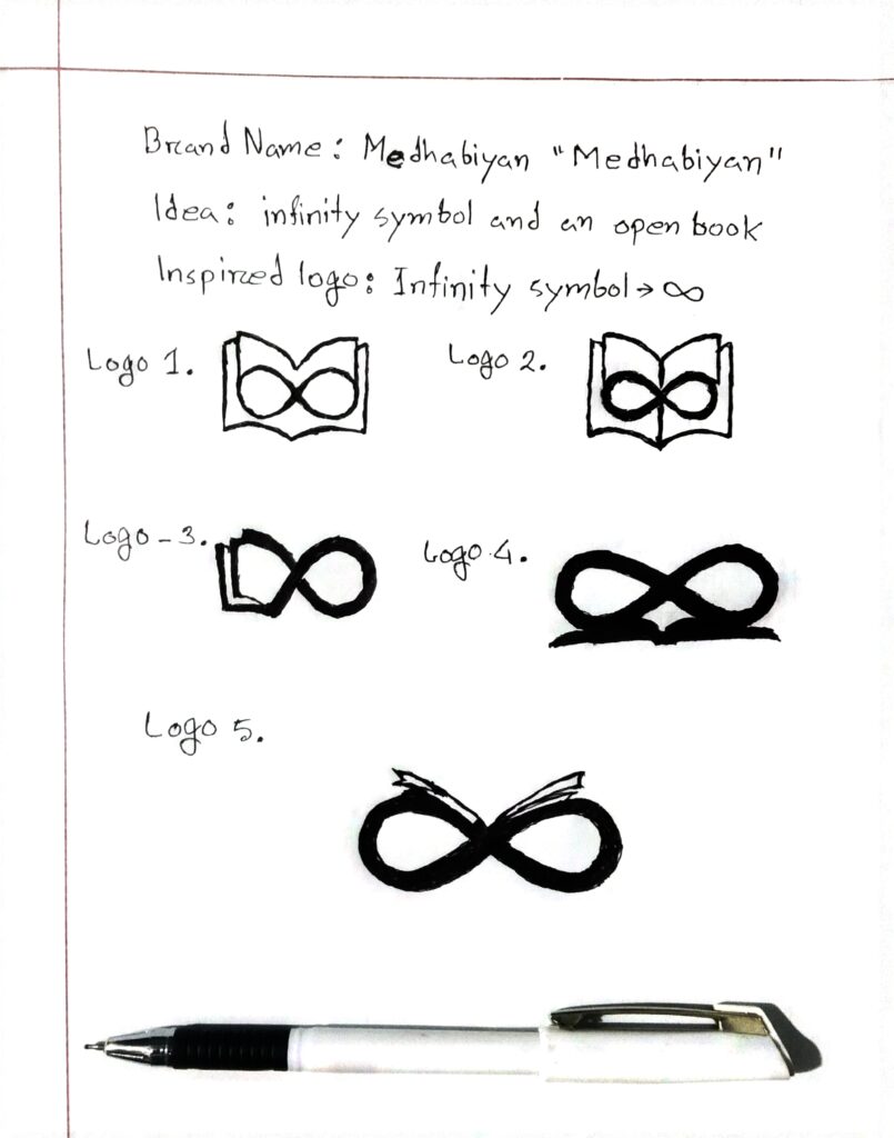
3️⃣ Concept Sketching
- 4–5 concept sketches drawn by hand
- Explored variations of the book-inside-infinity symbol
- Ideas 4 & 5 were the most balanced and expressive.e
Explanation: The sketching phase began with pen and paper, where I explored different ways to merge an open book inside an infinity loop. Out of the 4–5 sketches I made, concepts 4 and 5 stood out for their balance, visual clarity, and potential uniqueness. These became the foundation for the digital execution.
4️⃣ Digital Draft Design
- Main Tool: Adobe Photoshop
- Fonts Used: Poppins (Google Fonts)
- Total Drafts Created: 3
- Custom Elements: Hand-crafted open book graphic in Photoshop
Explanation: After finalizing the sketch, I translated it into digital form using Adobe Photoshop. I designed and refined the open book graphic myself to integrate seamlessly with the infinity loop. I chose the Poppins font for its modern and clean appearance. Across 3 different drafts, I experimented with proportions, font positioning, and spacing to create a balanced and professional logo.
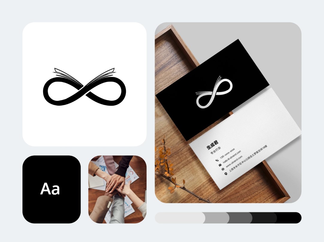
5️⃣ Color Palette & Typography
Tools Used: Coolors.co + Personal Color Sense
Font Style: Poppins – Bold and Light
Color Codes:
- #1d3557 – Deep Blue (Trust, Focus)
- #ff6b00 – Bright Orange (Energy, Optimism)
- #457B9D – Steel Blue
- #A8DADC – Soft Aqua
- #F1FAEE – Mint Cream
- #E63946 – Coral Red
- #ffffff – White (Clarity)
- #000000 – Black (Boldness & Contrast)
Explanation: The color palette was chosen to reflect the trustworthiness, energy, and clarity that an education brand should represent. Deep blue ensures focus and professionalism, while bright orange adds motivation and youthful energy. Poppins, in both bold and light styles, gave the logo a modern and confident voice, perfect for a brand that empowers learners.
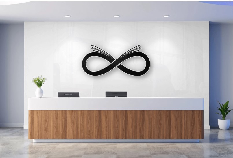
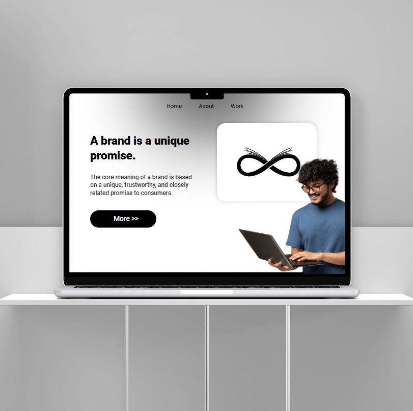
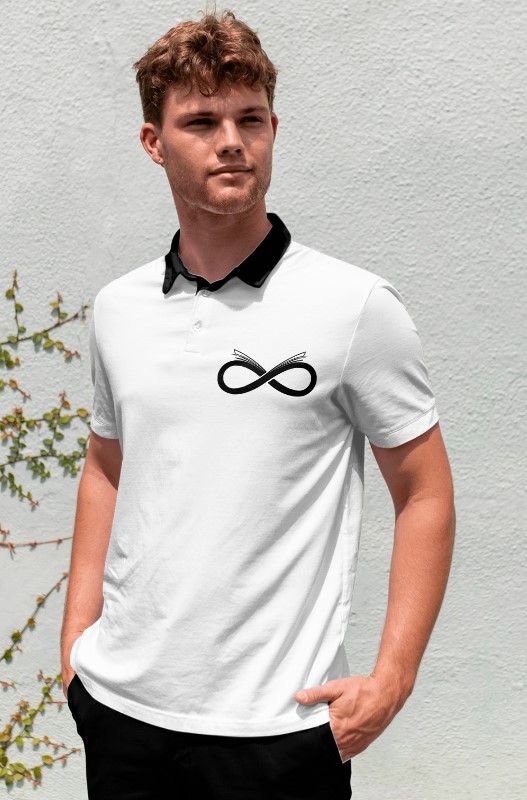
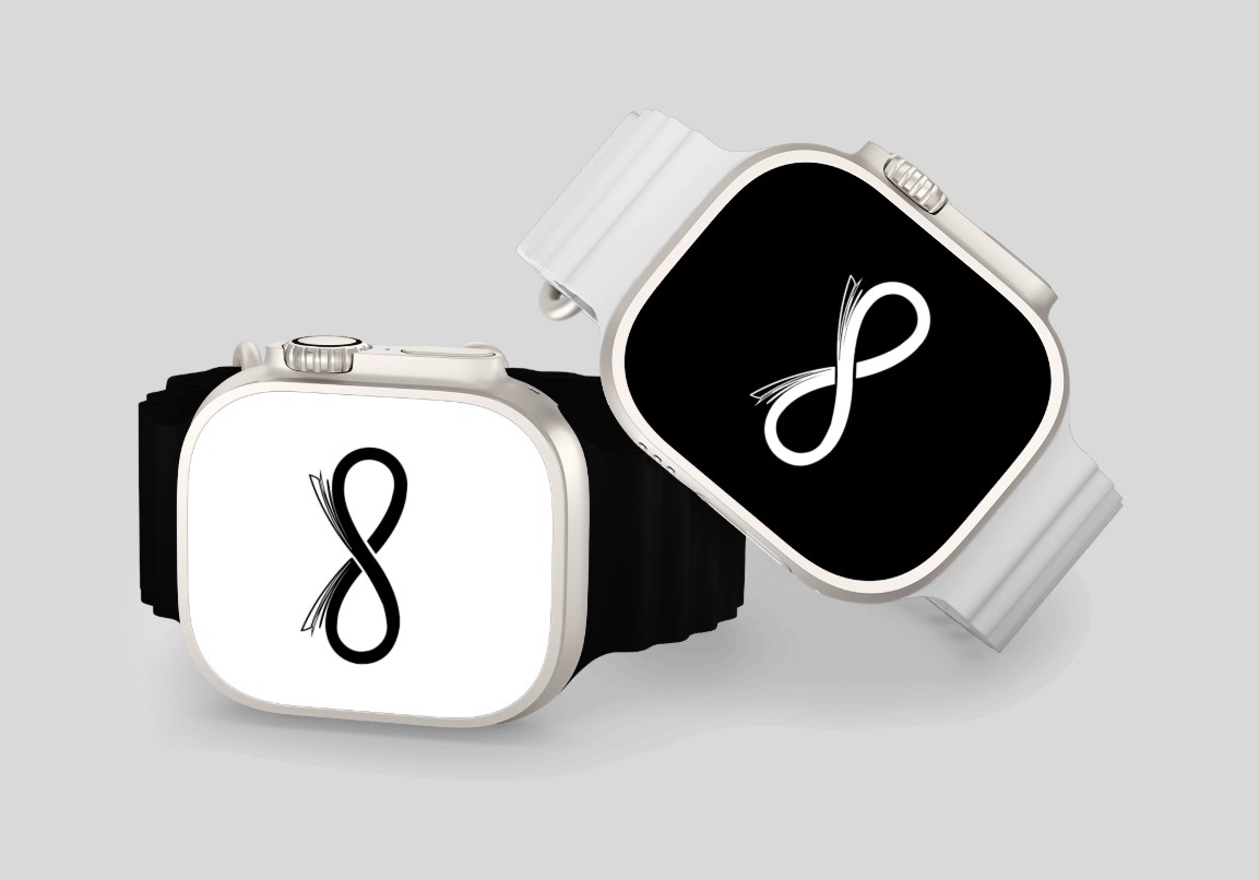
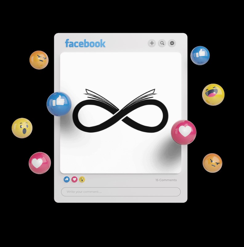
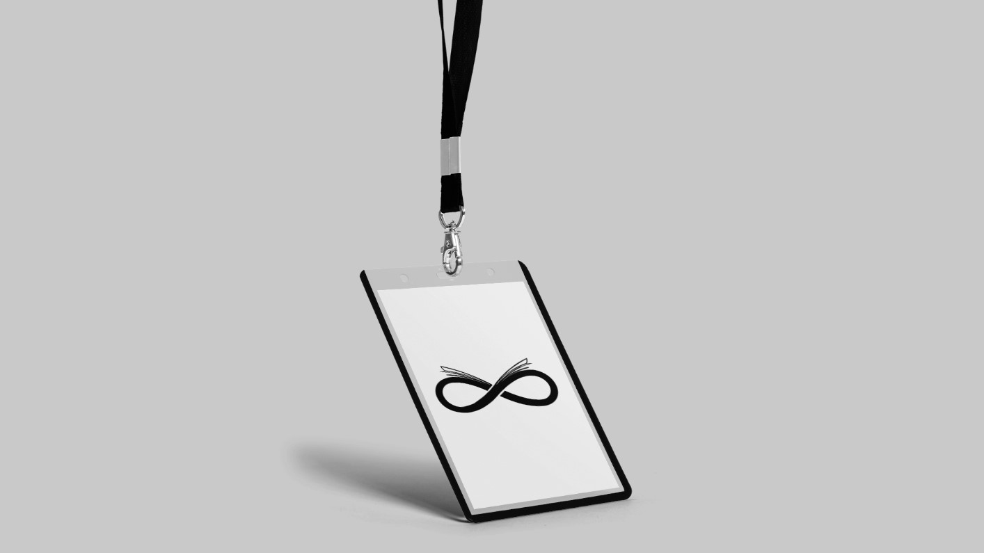
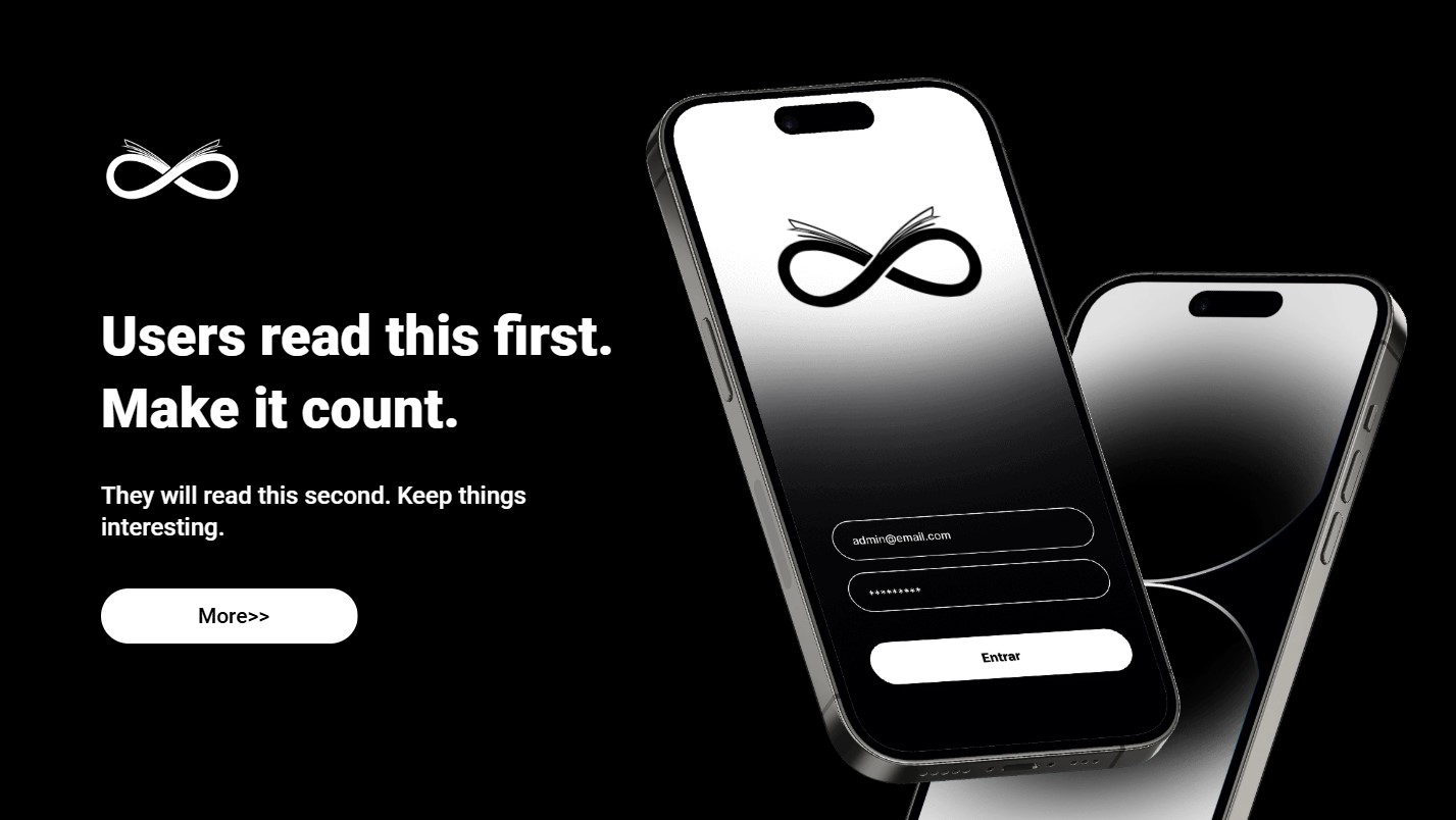
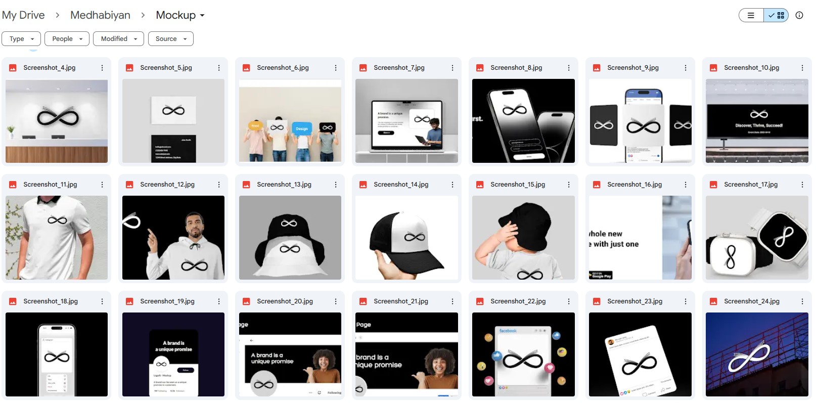
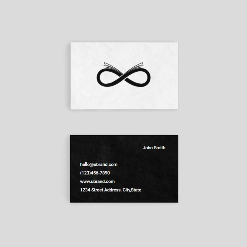
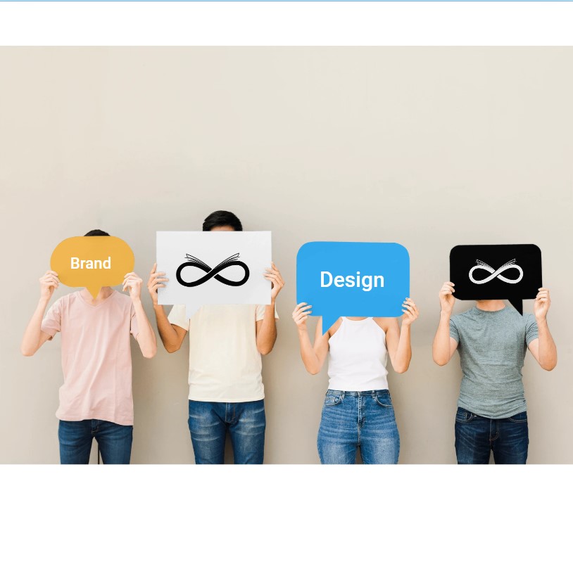
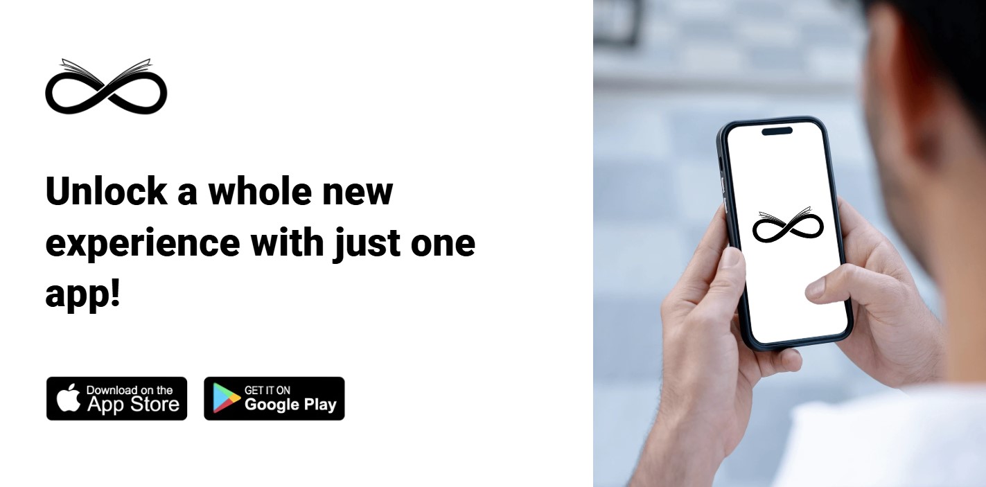
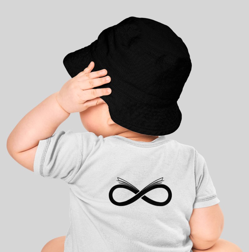
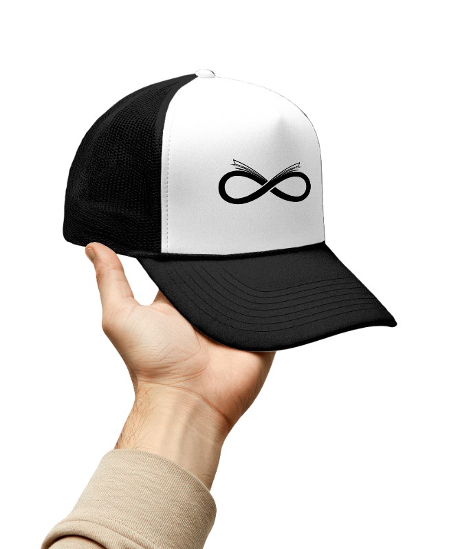
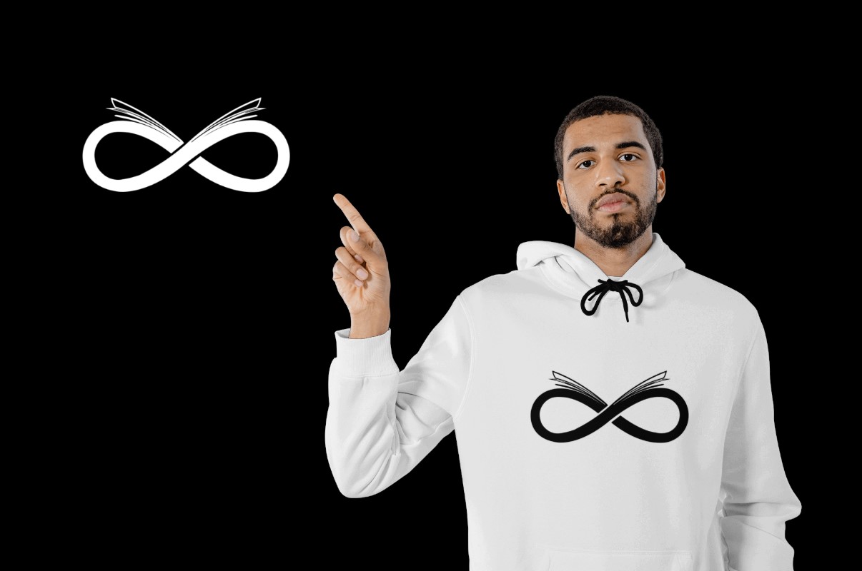
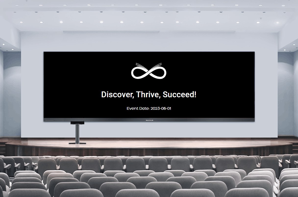
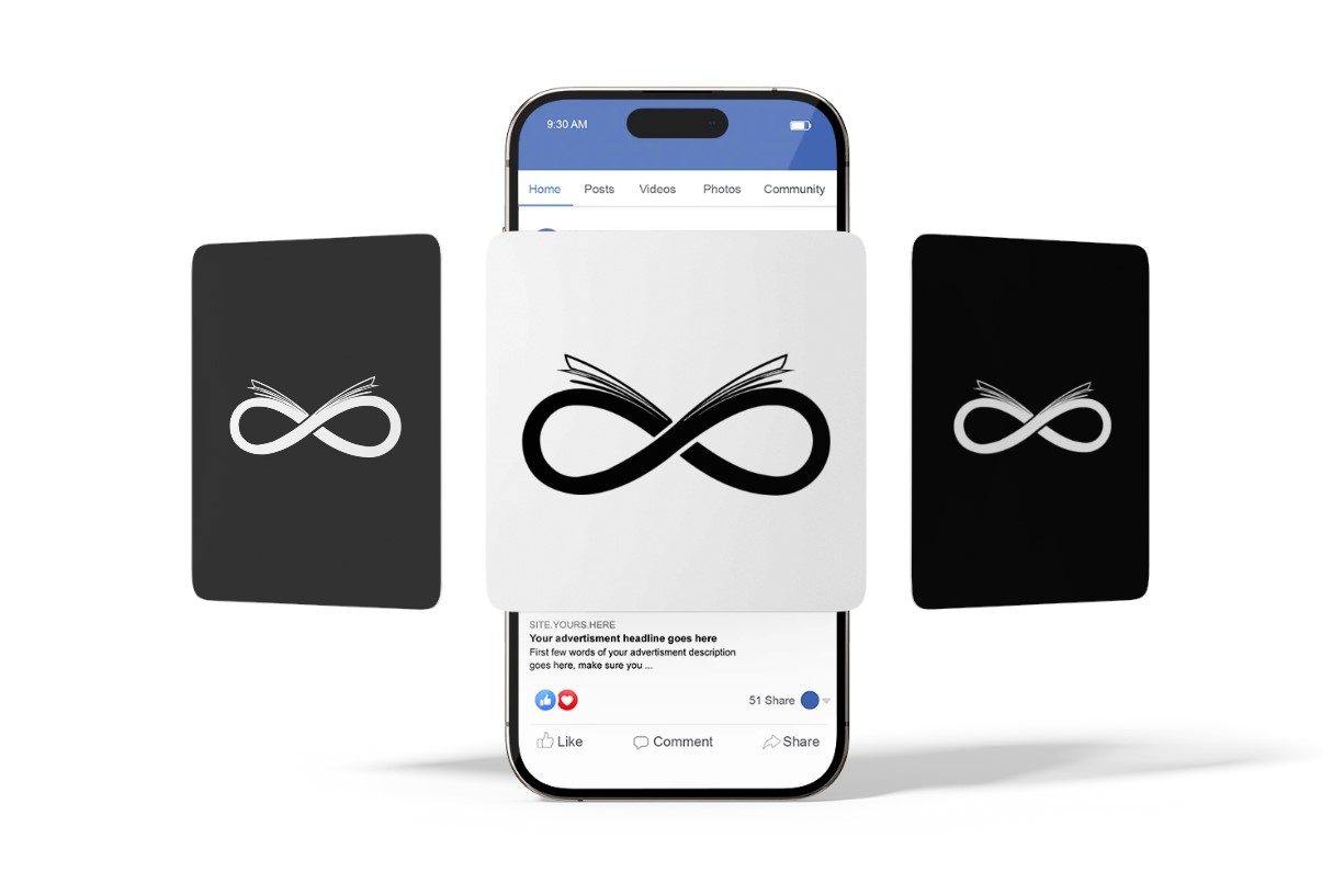
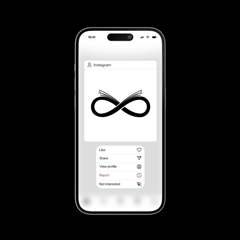
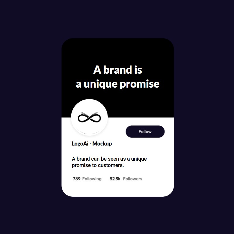
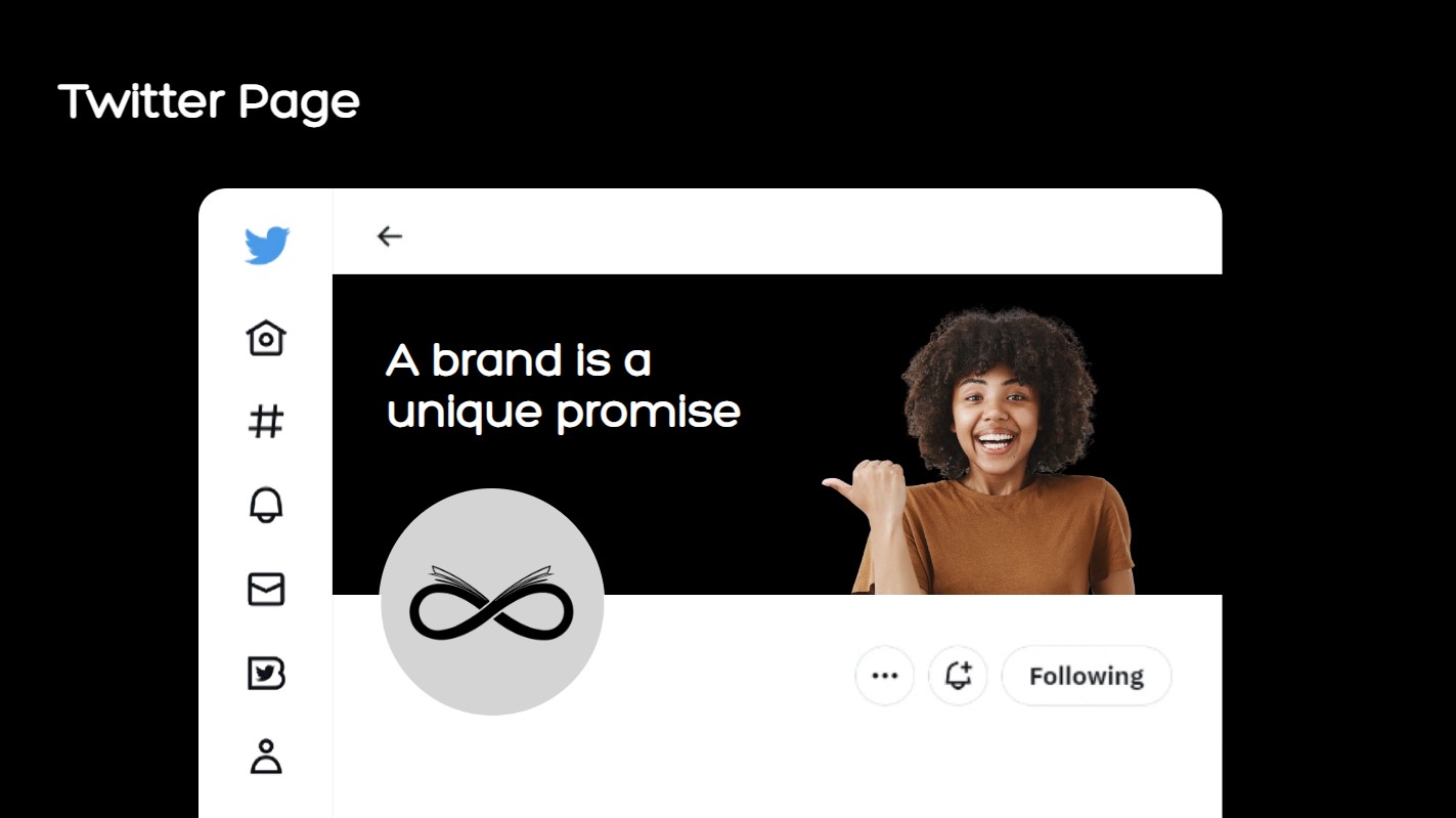
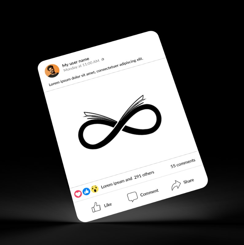
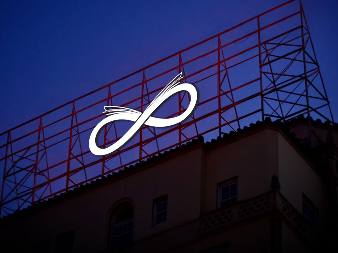
6️⃣ Mockup & Visualization
- Tool Used: LogoAI Mockup Generator
- Total Mockups Created: 20+
- Display Platforms: T-shirts, Book Covers, Business Cards, Mobile App Screens, LED Boards, and more
- Most Impactful Mockups: T-shirt, Book Cover, Business Card
Explanation:
To bring the logo to life, I created over 20 mockups using LogoAI. These mockups helped visualize how the logo would look in real-world applications. It was displayed on educational materials like book covers, as well as digital and promotional items like mobile apps, T-shirts, and business cards. This helped ensure brand consistency across all platforms and made the concept feel grounded and real.
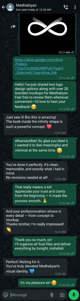
7️⃣ Client Feedback & Revisions
- Platform: WhatsApp (Text Communication)
- Feedback: Instantly loved the first draft
- Revisions: None required
- Client Reaction: Extremely positive; praised the design, simplicity, and professional execution.
Explanation: As soon as I shared the first draft through WhatsApp, the client responded with genuine excitement. They loved the clean design, the book + infinity integration, and the overall simplicity. They specifically praised my professionalism and how effectively I turned their vision into reality.
No revisions were requested, which reflected how well the final design aligned with their expectations. Their feedback reaffirmed the importance of listening carefully to the client’s brief and translating it through thoughtful design.
8️⃣ Final Delivery
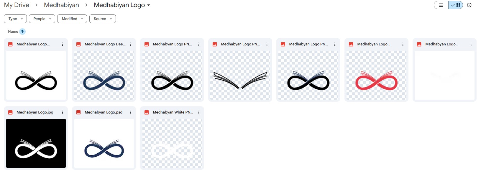
File Formats Delivered: PNG, SVG, PDF, PSD, ZIP
Brand Guide Included:
- Color codes
- Font name
- Logo variations (light/dark/icon-only)
Delivery Platform: Google Drive + WhatsApp
Explanation: All final files were delivered in high-resolution formats, including PNG, SVG, PDF, and PSD, bundled inside a well-organized Google Drive folder. I also included a mini brand guide covering the core color palette, font details, and usage instructions. For convenience, a WhatsApp message was sent with a quick-access download link, ensuring a smooth handover.
Frequently Asked Questions about Medhabiyan Logo Design
The main objective of the Medhabiyan Logo Design was to create a visually impactful and meaningful identity that reflects the brand’s focus on education and innovation.
The concept behind the Medhabiyan Logo Design was developed through research, brainstorming, and sketching ideas that symbolize intelligence, growth, and creativity.
The Medhabiyan Logo Design incorporates elements like a book, brain, and upward motion to represent knowledge, intellect, and forward-thinking.
For the Medhabiyan Logo Design, tools like Adobe Illustrator and Procreate were used to transition from hand-drawn sketches to a polished digital logo.
The Medhabiyan Logo Design enhances brand recognition through its unique concept, clean lines, and memorable symbolism aligned with the brand’s vision.
The Medhabiyan Logo Design was inspired by themes of intelligence, growth, and education to reflect the brand’s mission.
Adobe Illustrator and Procreate were used to bring the Medhabiyan Logo Design from sketch to final form.
The Medhabiyan Logo Design stands out through its meaningful symbols, clean execution, and alignment with the brand’s identity.
🌟 Final Outcome
A clean and symbolic logo that merges infinite learning with clarity and simplicity—perfect for educational platforms, branding, and real-world usage.
Explanation: The final logo for Medhabiyan successfully captures the essence of endless learning through the symbolic integration of an infinity loop and an open book. Its clean design, modern typography, and carefully chosen color palette ensure clarity and emotional connection, making it ideal for educational branding. The logo remains highly recognizable across all sizes and mediums—from digital platforms to printed materials like books and merchandise. This minimal yet meaningful identity reflects the brand’s mission to deliver quality education with purpose. The simplicity in execution combined with depth in concept makes this logo both timeless and functional for long-term use. Want to explore more? Check out the creative process behind our Yummy Lover Logo Design and Prime WV Logo Design. For more projects, visit our full Work Page.
💬 What Made This Project Special
✅ First Draft Approval ✅ Symbolism of Knowledge & Infinity ✅ Hand-drawn Custom Elements ✅ 100% Client Satisfaction
Designing the Medhabiyan logo was a meaningful experience. From ideation to final delivery, I stayed true to the brand’s vision of making education timeless and accessible. The blend of infinity and open book captured the heart of their mission, and the appreciation I received confirmed the design’s success. I’m honored to help build such purposeful identities, and look forward to crafting more powerful stories ahead.